Teaching Data Visualizations
I have taught 100’s of students the principles of visualizing data across organizations ranging from small non-profits to Fortune 500 companies. Constantly learning has allowed me to publish visualizations with over 10,000 views and I want to ensure that I share my knowledge. As my focus shifted from data visualization to application based design, I have continued to teach groups, teams, and individuals. I have extended my training to include aspects of UX research, UX design, and Figma basics.
Training Dashboard
This dashboard is used to determine the amount of time spent in training and number of classes the team spends on training others.
Capacity Calculator
This tool merges the benefits of UX and data visualization. This tool is used for ‘what if’ analysis to assist the company in allocating the right resources in a shop-floor.
Teaching
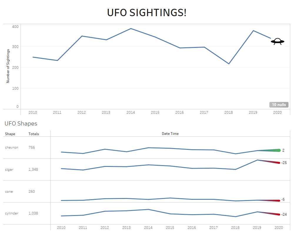
I believe that learning should be fun. The more entertaining a class is, the more likely students are to retain the information. I always use quirky data, helping to increase student attention. This data ranges from UFO sightings, to the estimated intelligence of dogs, to Bigfoot sighting. Designing a class is similar to UX design. They both depend on knowing and empathizing with the audience and users. In both scenarios I am creating a user-centric experience.
Showing how icons can be added to graphs instead of text.
Keeping class fun with Bigfoot data.
Knowing the needs of students. This was a class for data scientists on creating linear, binomial, and polynomial graphs.


